The Goal
The goal was to optimize the UI and the UX of the Hrmony progressive web app, so that it is more accessible for the users and easier to understand. There were some low contrast colors on different fonts and other graphical elements that needed to be optimized, so that they pass the WCAG 2.0 guidelines for contrast accessibility. In addition some usability changes were made, that focused mostly on rearranging importantg elements or describing them in a better way.
Outcome
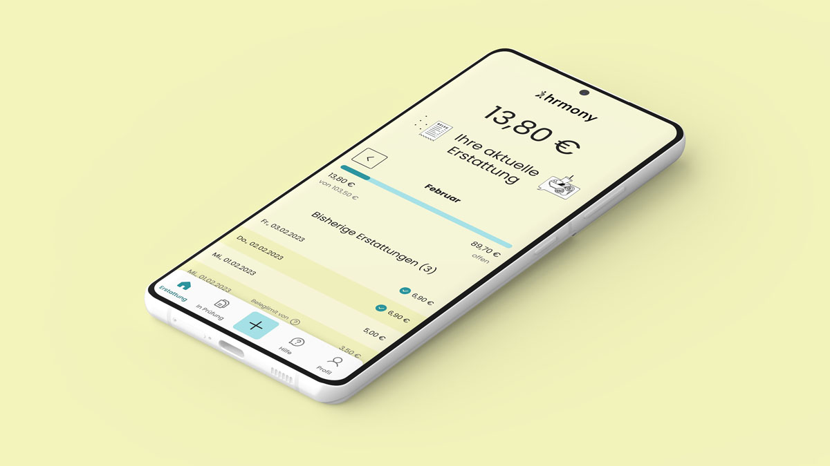
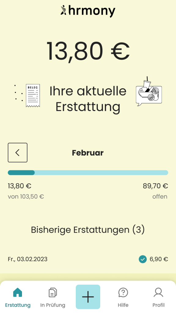
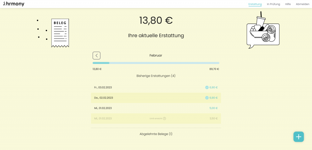
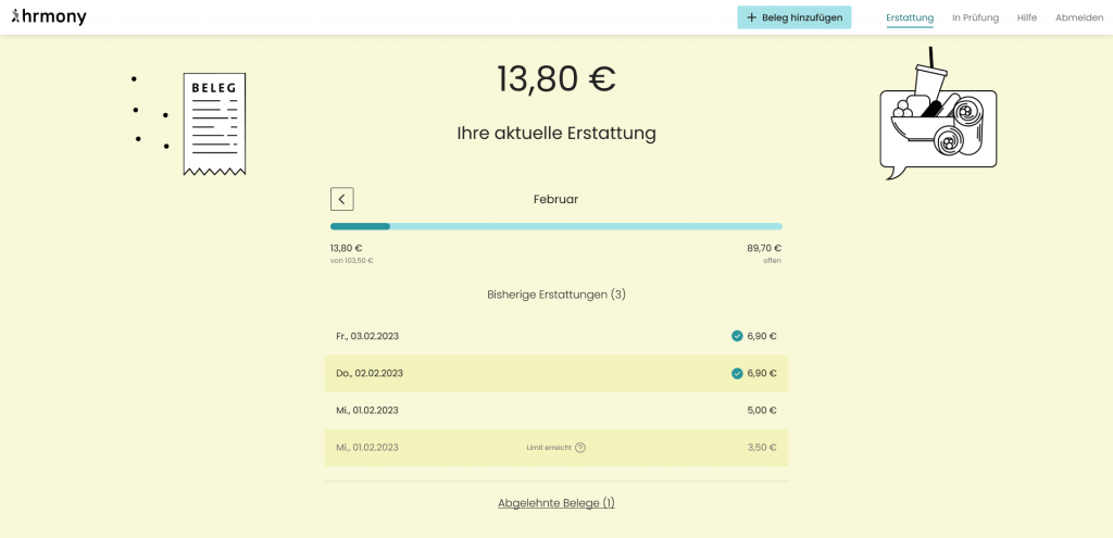
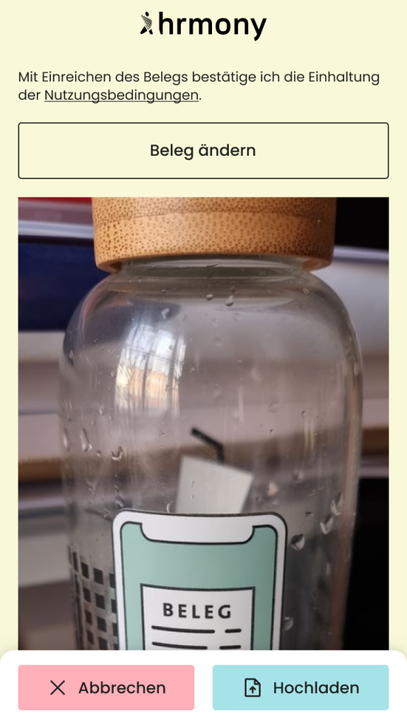
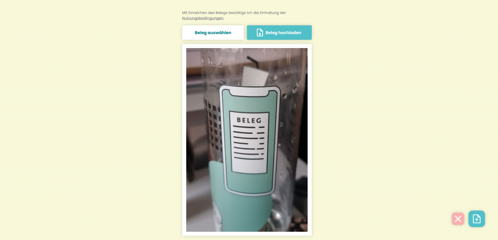
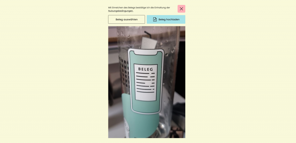
The part with the colors was straight forward, as it was easy to identify the low contrast colors with a variety of checking tools. Changes were made for some of the fonts but also for icons. I did the same with the navigation, were the icon-style was unified as well. In the following you can see some examples of the changes. It always shows the state before and after.
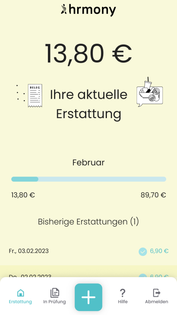
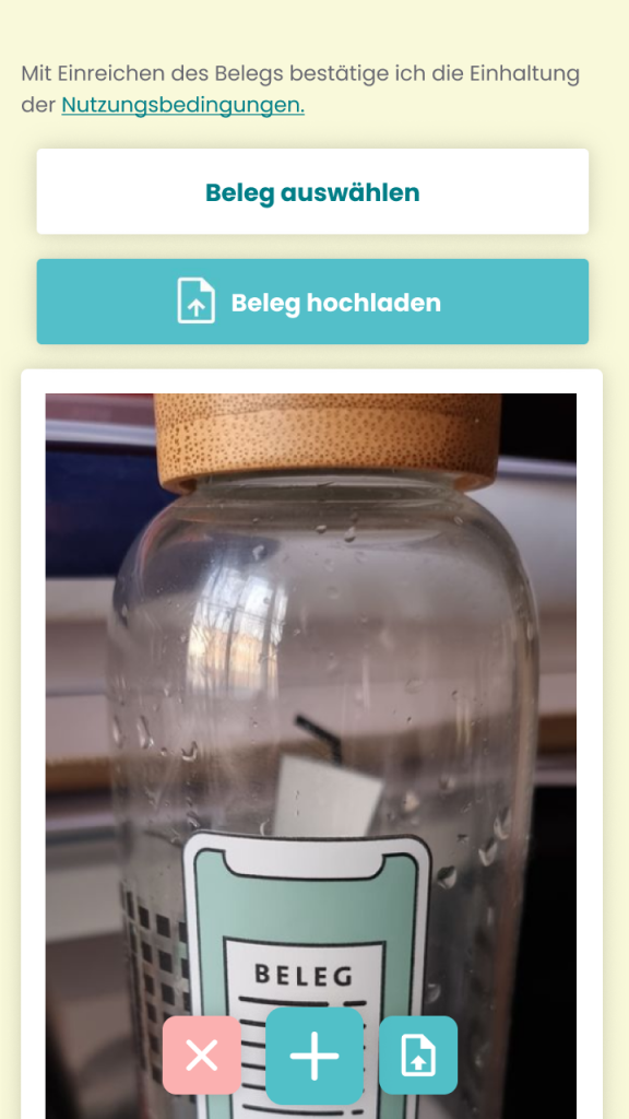
This is one of the most important screens of the app, as the users see it everytime they want to upload a new receipt by hitting the plus-button on the home screen. The following screen is the second step with the confirmation. In the old version there were 5 different CTAs partly with reduntant function. That’s why I eliminated two of them and changed the styles and the wording of the remaining buttons so that it is easier to understand.
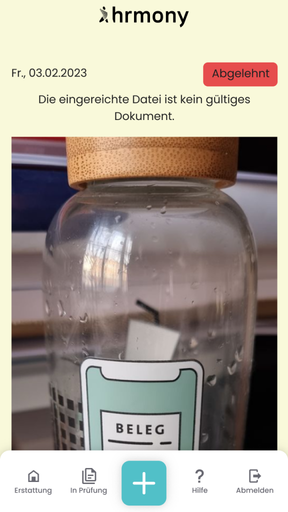
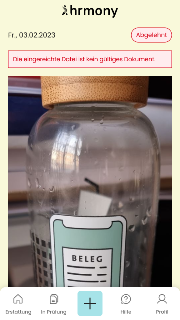
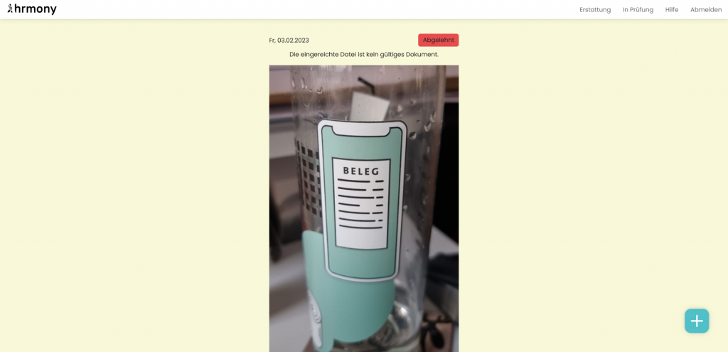
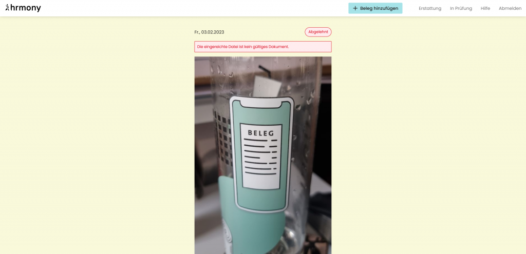
Other optimizations were made on the success and error screens. Therefore the labels were redesigned, so that they don’t look like clickable buttons anymore. In addition, the messages all got another style to make them easier to scan.
Conclusion
With the help of the development team the changes were implemented very fast. And in the following weeks there was a lot of positive feedback on these changes, both internally and externally. I saw a positive trend with a feedback tool that Hrmony used for tracking, but also with external platforms such as OMR Reviews.
The look of the platform has already improved in recent months.
Christoph, People & Culture at Financial Software Architects GmbH