The Product
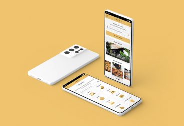
This is a follow-up project for the mobile Food menu app. That means there was no need to do the Emphasize and Define phase again. The goal here was to create a responsive web design that is optimized and can be viewed on different devices like mobile phones, tablets and desktop computers.
My Role
- Sitemap creation
- Digital wireframing
- Low & high-fidelity prototyping
- Accounting for accessibility
- Iterating on designs
Tools
- Adobe XD
- Adobe Photoshop
- Google Workspace
The Solution
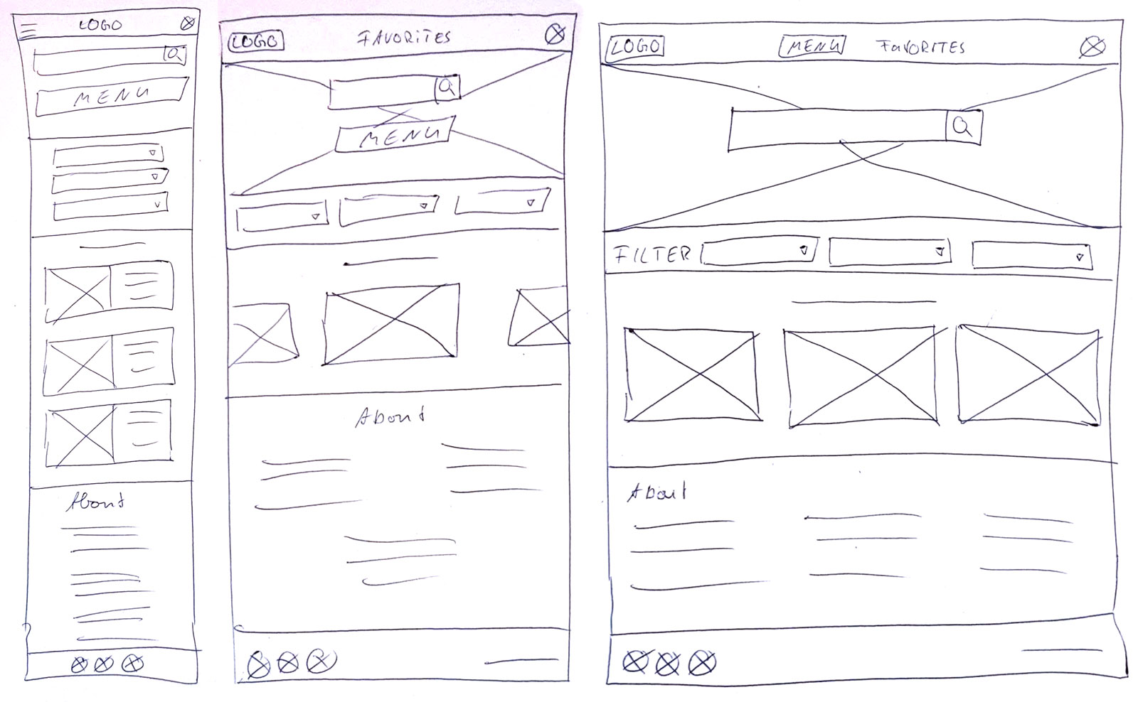
Sketching the Ideas
The first task I needed to think about was how the current screens of the mobile app will look on the other devices like tablets and desktop. That means at the end how to rearrange different parts and elements but also think about different ways to navigate or other parts that could be added or deleted.
In the following you can see drawn wireframes of the homepage how this will appear in a responsive website on mobile, tablet and desktop screens.
Low-Fidelity Wireframing
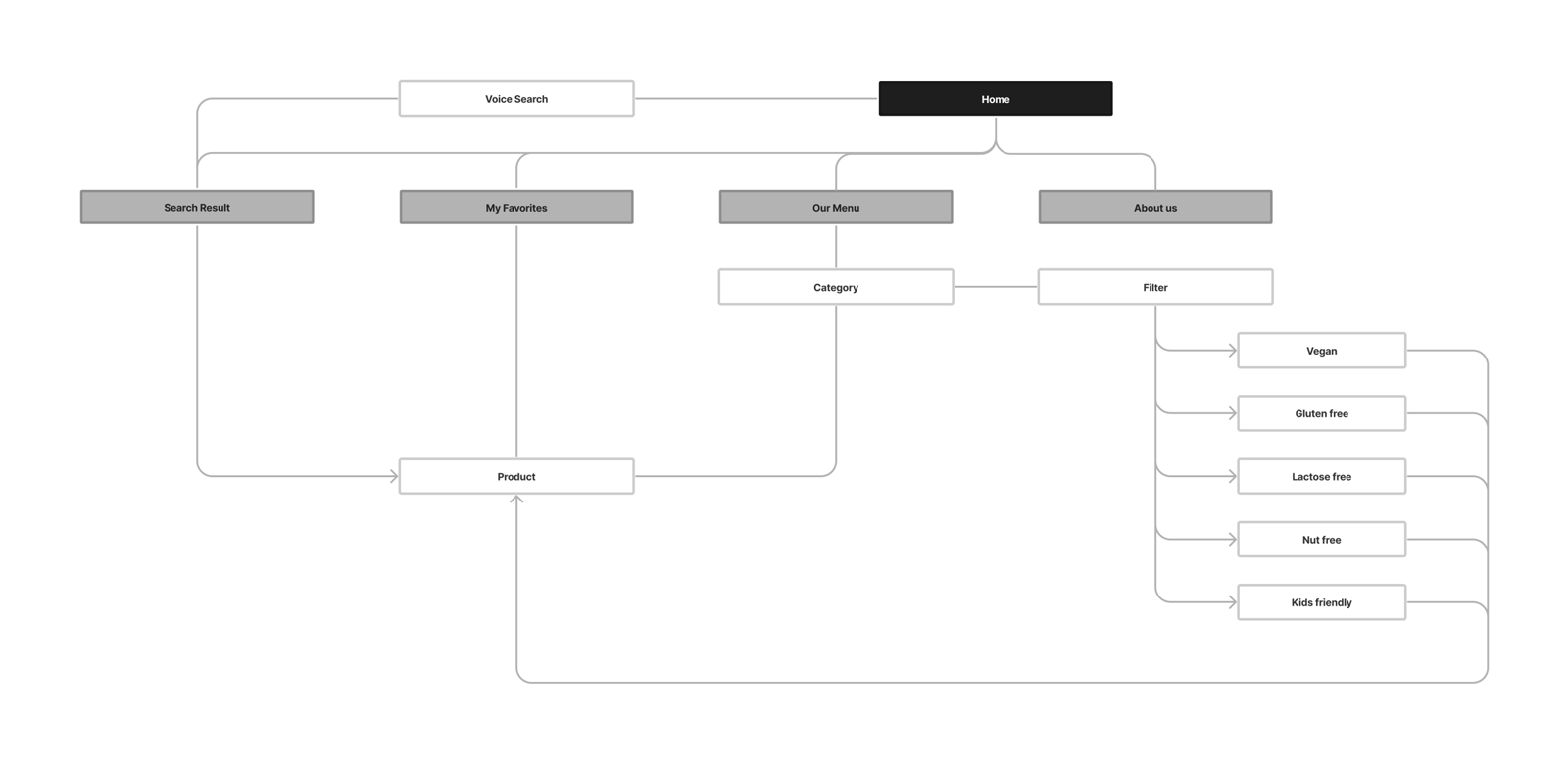
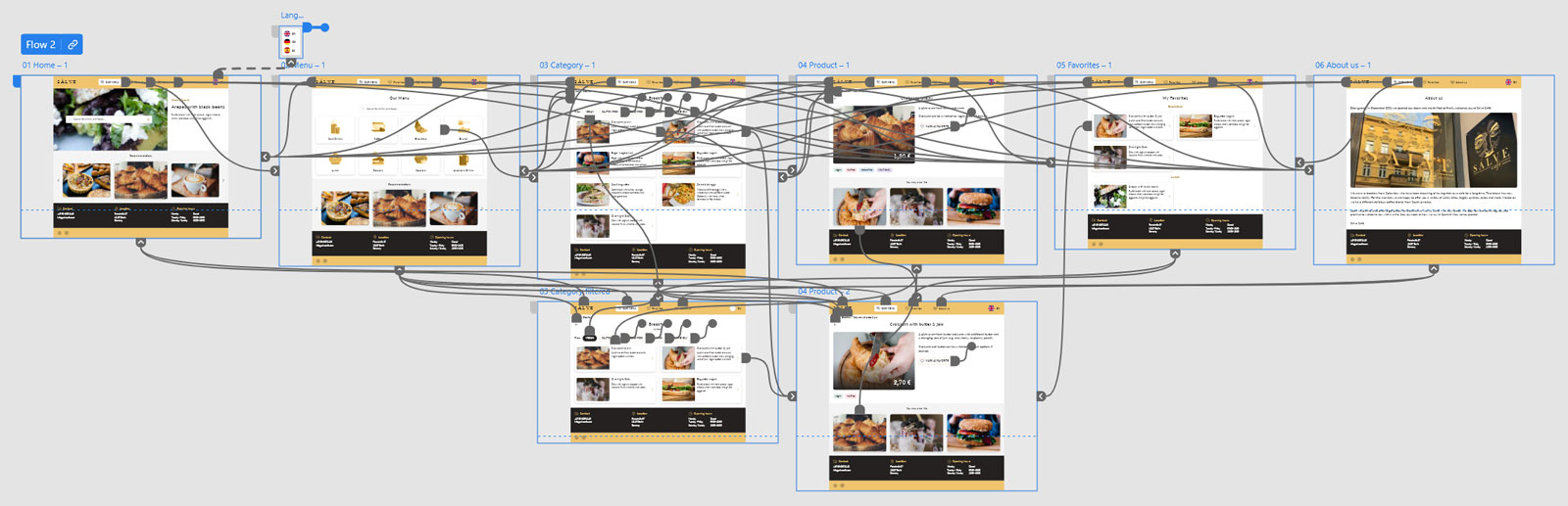
Before transforming these sketches into digital wireframes I decided to create a sitemap first. This sitemap shows all the different pages of the website and how they are connected.
For creating the digital wireframes I used the Tool Adobe XD. The following screens show some sample pages of the desktop version of the responsive website and the mobile version.
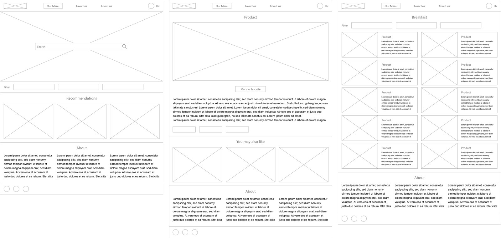
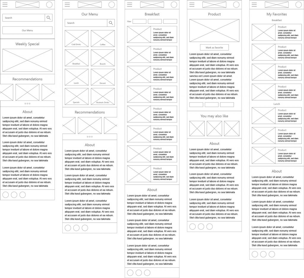
After creating the different wireframes of all the mandatory pages I transformed these into an interactive prototype. With the lo-fi prototype it’s possible to simply navigate through the pages and trigger some basic functions.
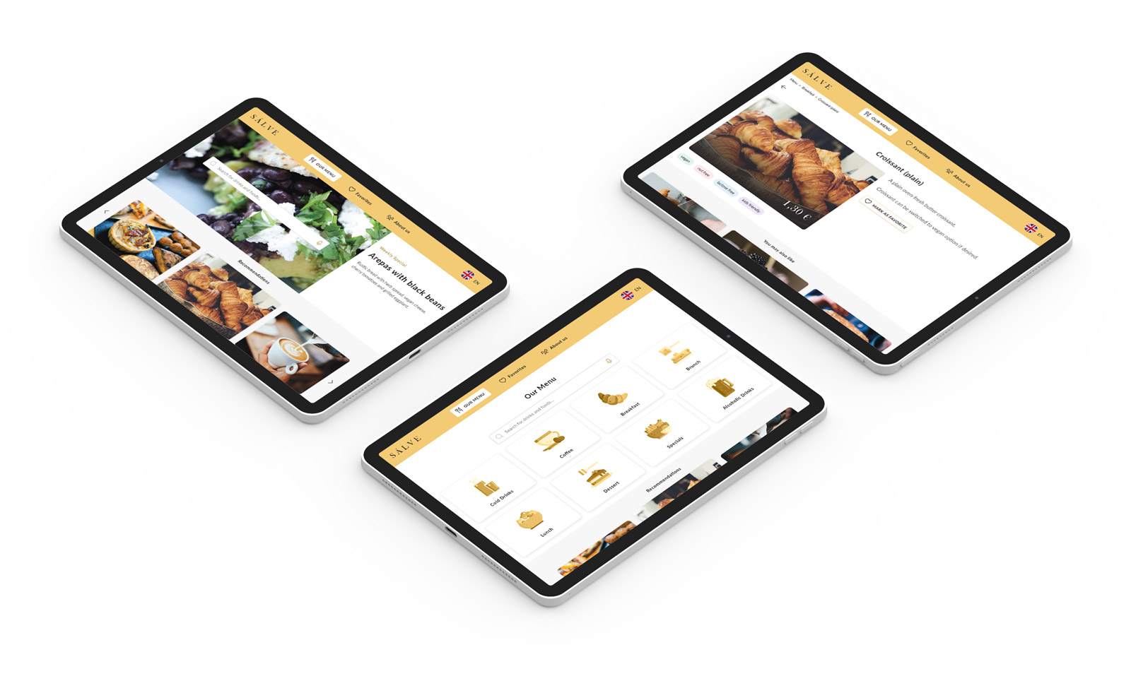
High-Fidelity Prototype
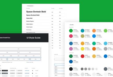
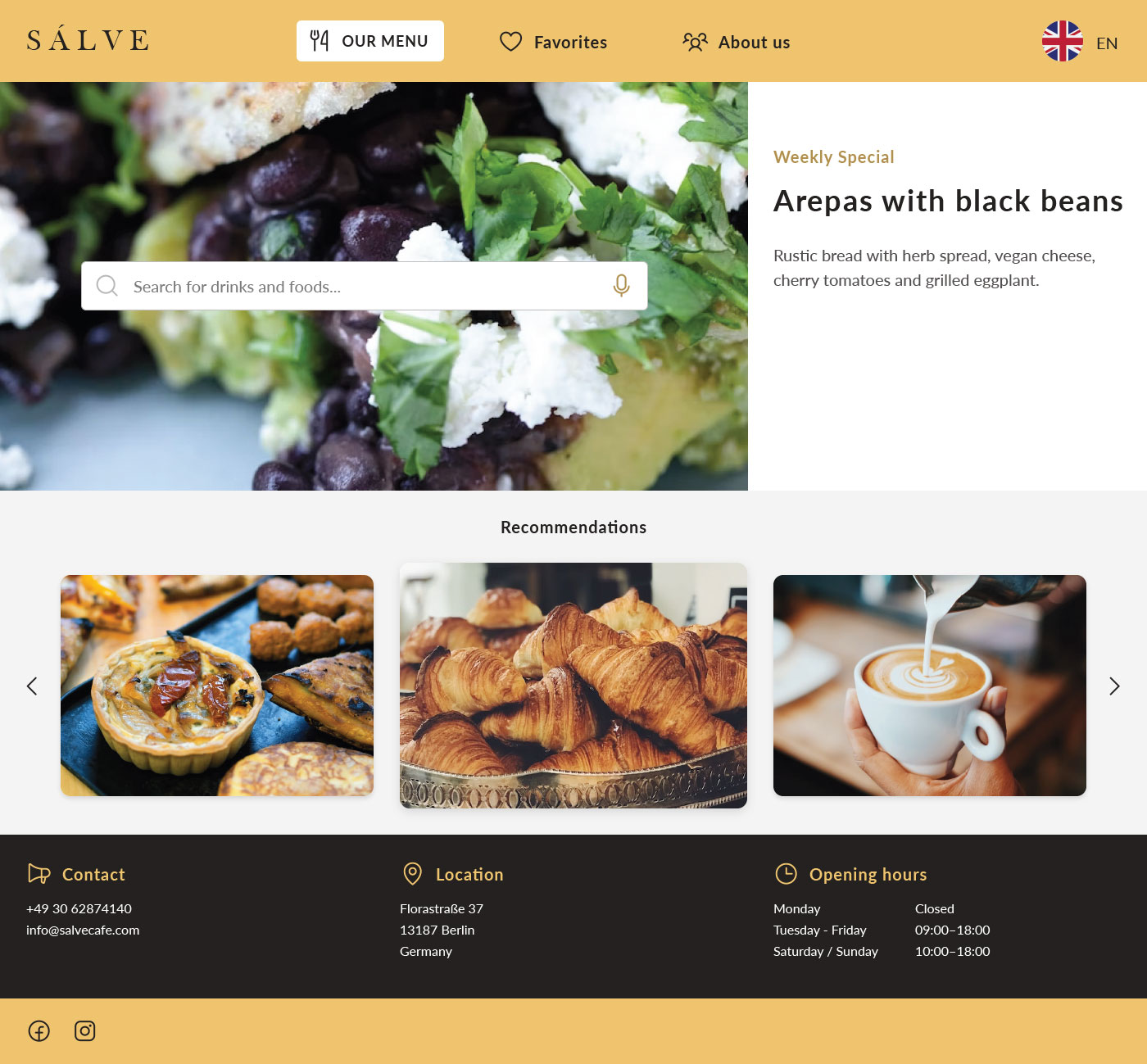
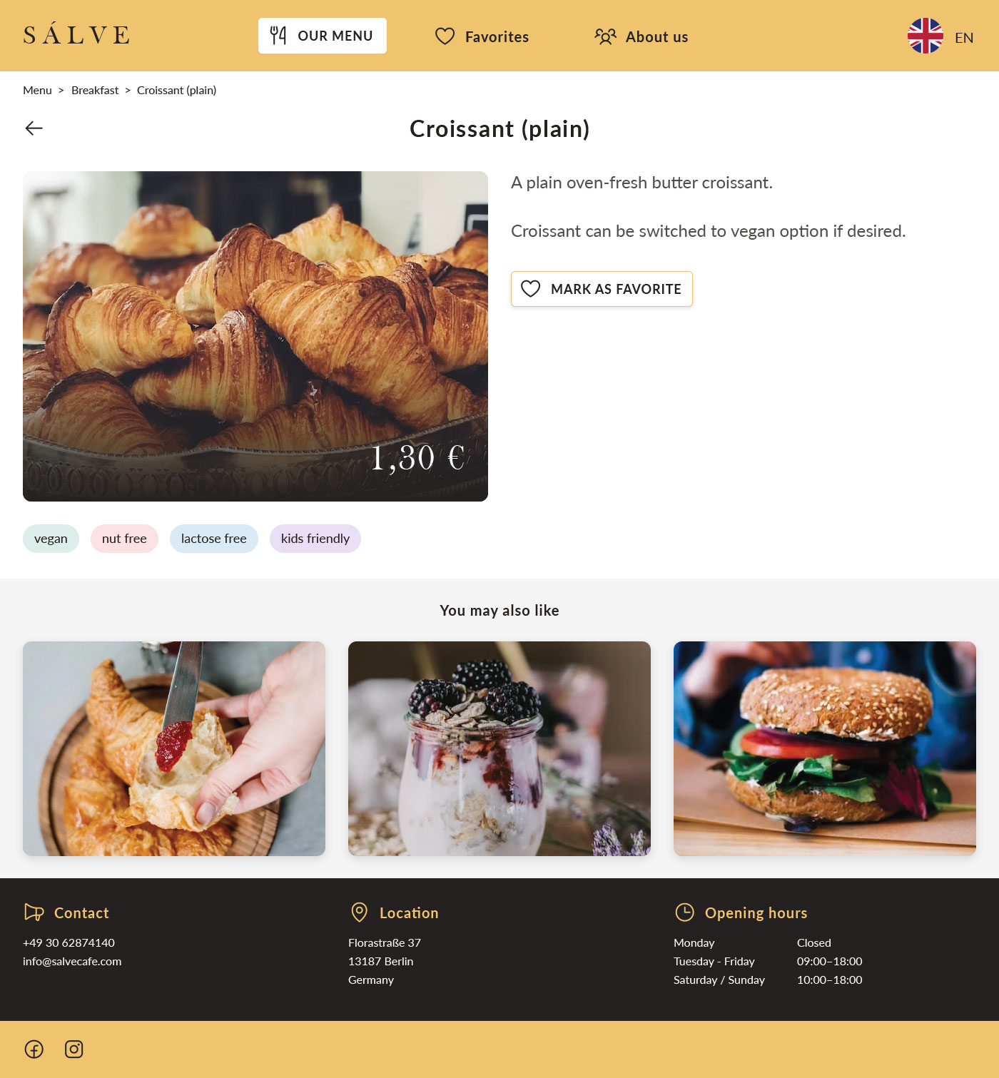
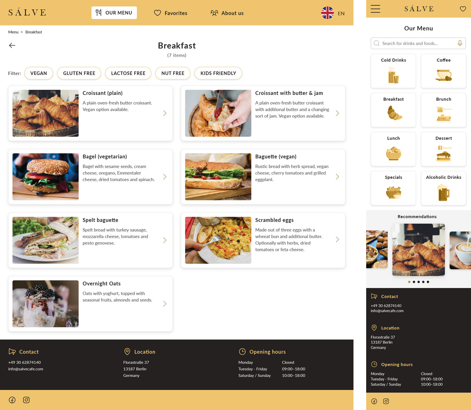
Since the visual appearance of the app was already given with the mobile app, there was no need to think about colors, fonts and imagery again. Therefore, I was able to directly start transforming the digital wireframes into mockups showing the final design of the responsive website.
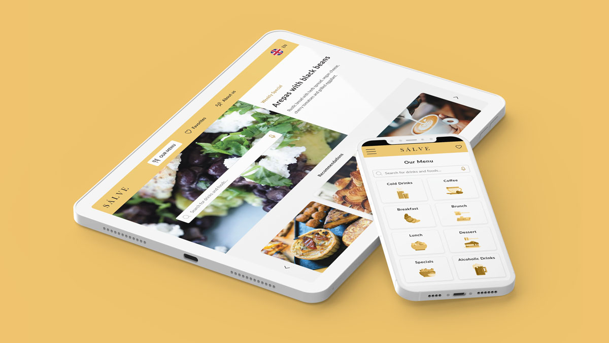
The following screens show a selection of the final desktop screens together with a mobile one. With these another prototype was created.
What did I learn from the Responsive Website?
On the one hand I learned about the differences of designing a mobile app and a responsive website that comes in several resolutions. Rearranging und redesigning different parts and modules but also think about different font-sizes for the devices was a very good learning.
On the other hand I was also using another tool to create the wireframes, mockups and prototypes. While I still used Figma to create the mobile app, I have now switched to Adobe XD. There are a lot of similarities for sure, but also some differences. And with creating the responsive website of my food menu app with another tool, extended my range of working tools immediately.