The Product
The app is for the visitors of a café that shows the complete menu to get an overview of all the products with some additional valuable information.
The Problem
Customers don’t know about the offer of the café and are also not able to find all the specials (e.g. vegan options) immediately.
The Goal
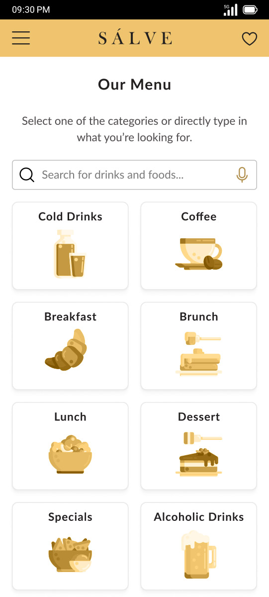
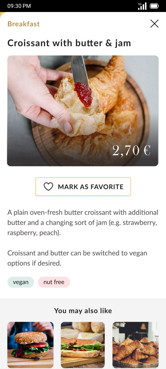
Design an app for the café with a complete menu of all offered products with the possibility to get additional details and filter for special needs.
My Role
- Research
- Competitive audit
- Paper & digital wireframing
- Low & high-fidelity prototyping
- Conducting usability studies
- Accounting for accessibility
- Iterating on designs
Tools
- Figma
- Adobe Photoshop
- Google Workspace
The Solution
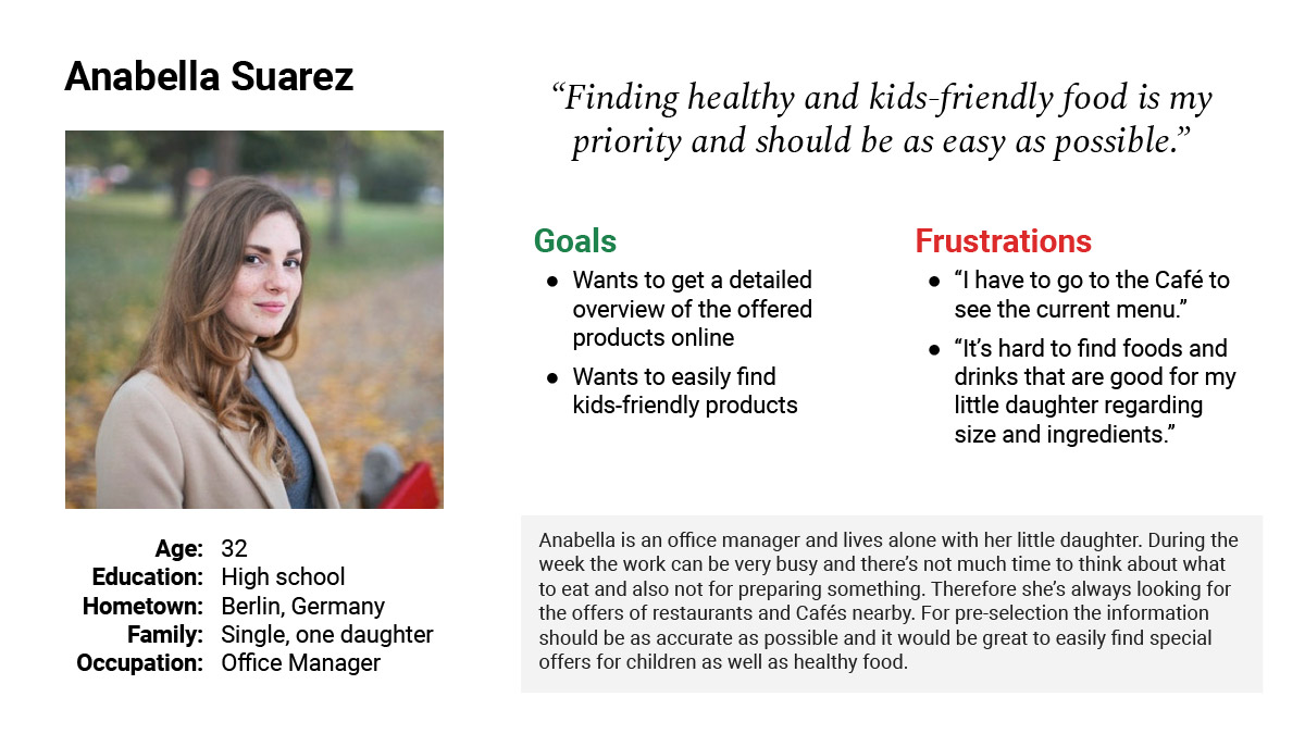
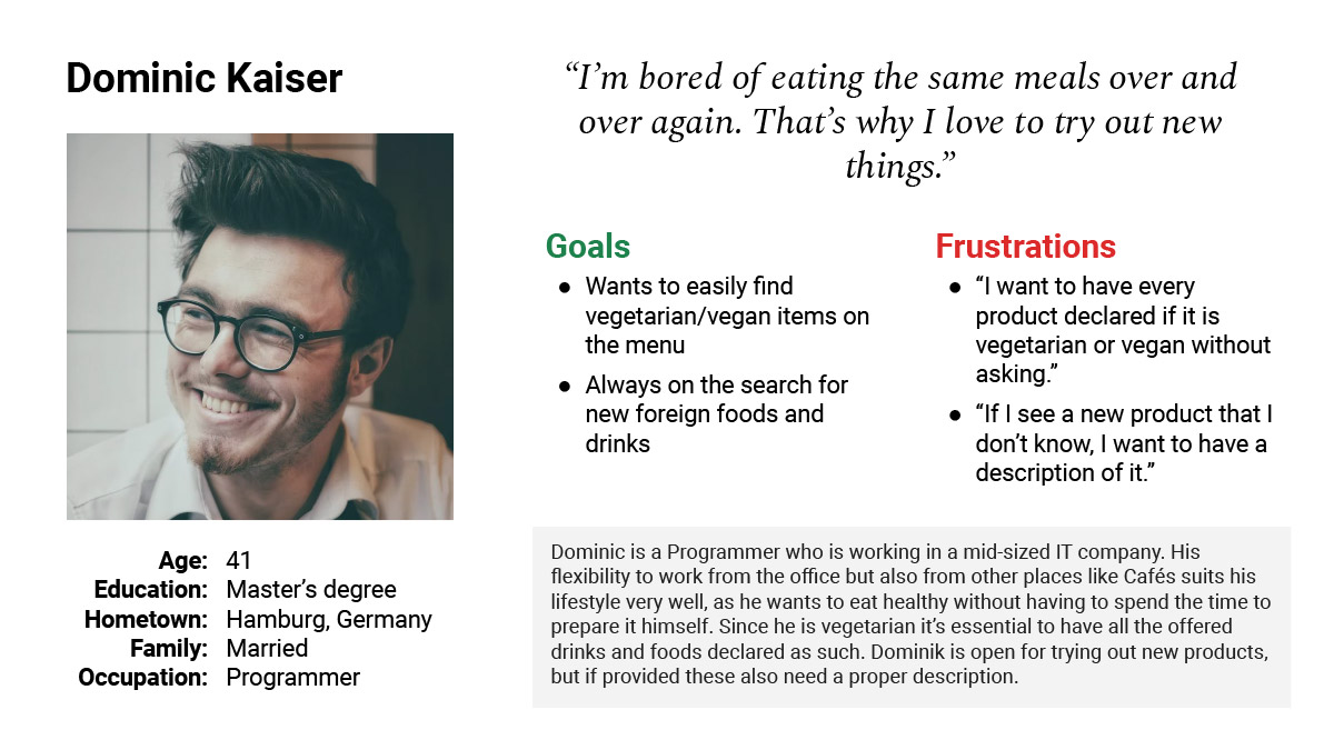
Crafting the Personas
Based on some interviews with colleagues and some family members but also with secondary research I created two personas with different goals and pain points.
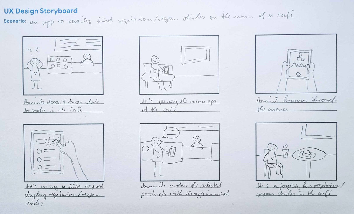
Sketching the Ideas
Before starting the design phase, I have drawn some storyboards (big picture and close-ups) to make the user problem more visual.
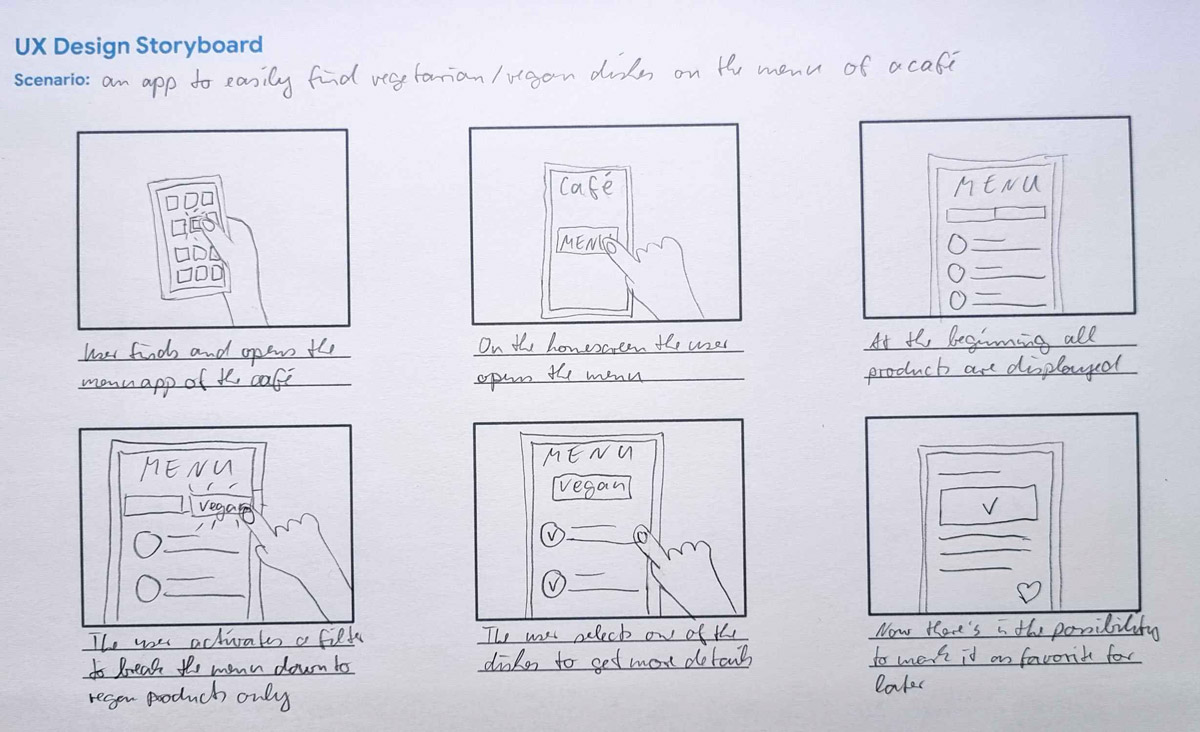
With these pictures in mind I then created drawn wireframes for all the different screens of the app, each in several versions. At the end I put the most meaningful elements together to create the final wireframes.
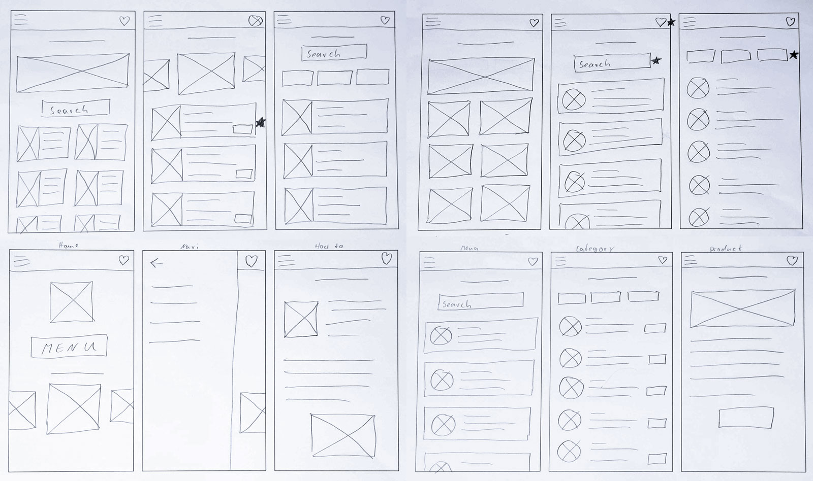
Low-Fidelity Wireframing
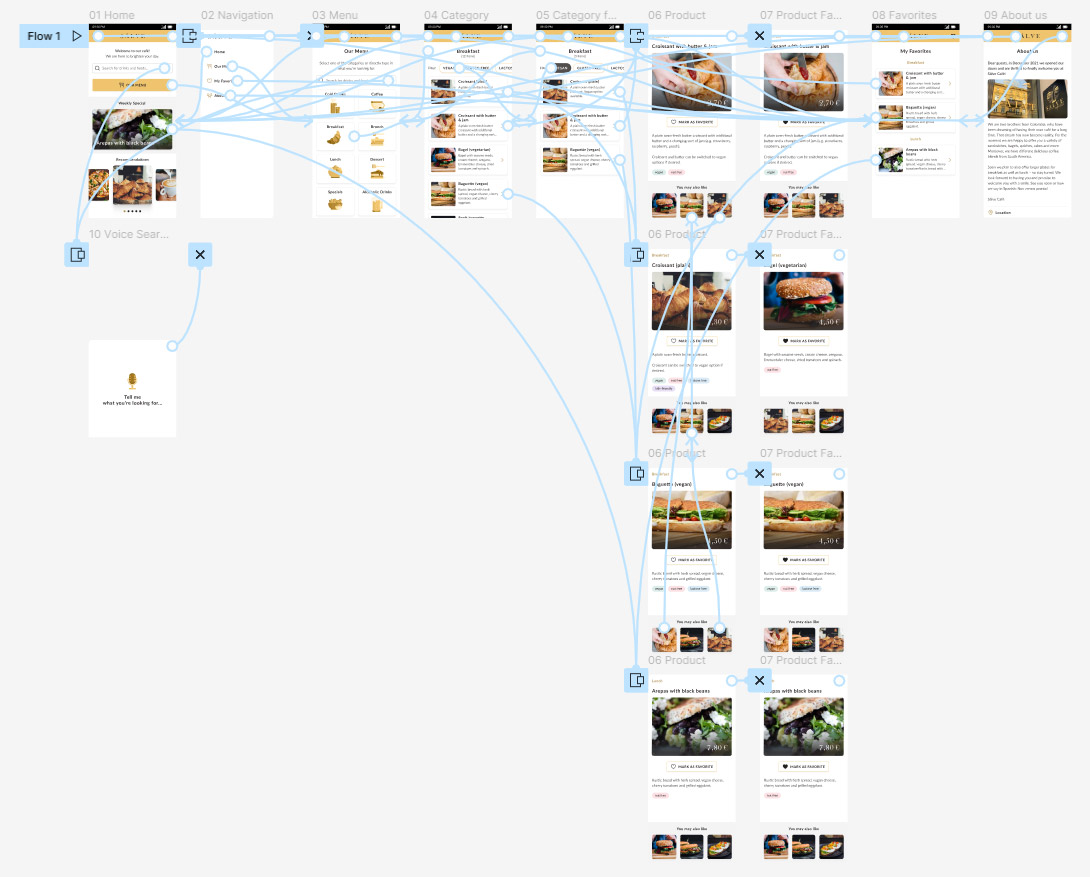
Based on my sketches the next step was to transform these into digital wireframes. I used the tool Figma for that. These are some examples of the most important screens.
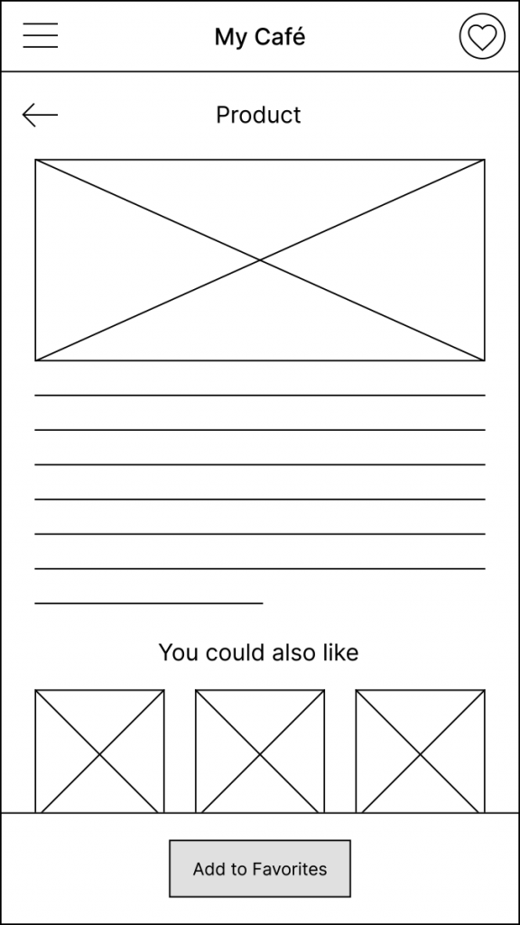
To value all my first ideas I planned to do a usability study. Before conducting this, I needed to create a fully functional prototype that covers the whole user flow. This is already the second iteration of the Lo-Fi Prototype with the insights that came out of the user testing phase.
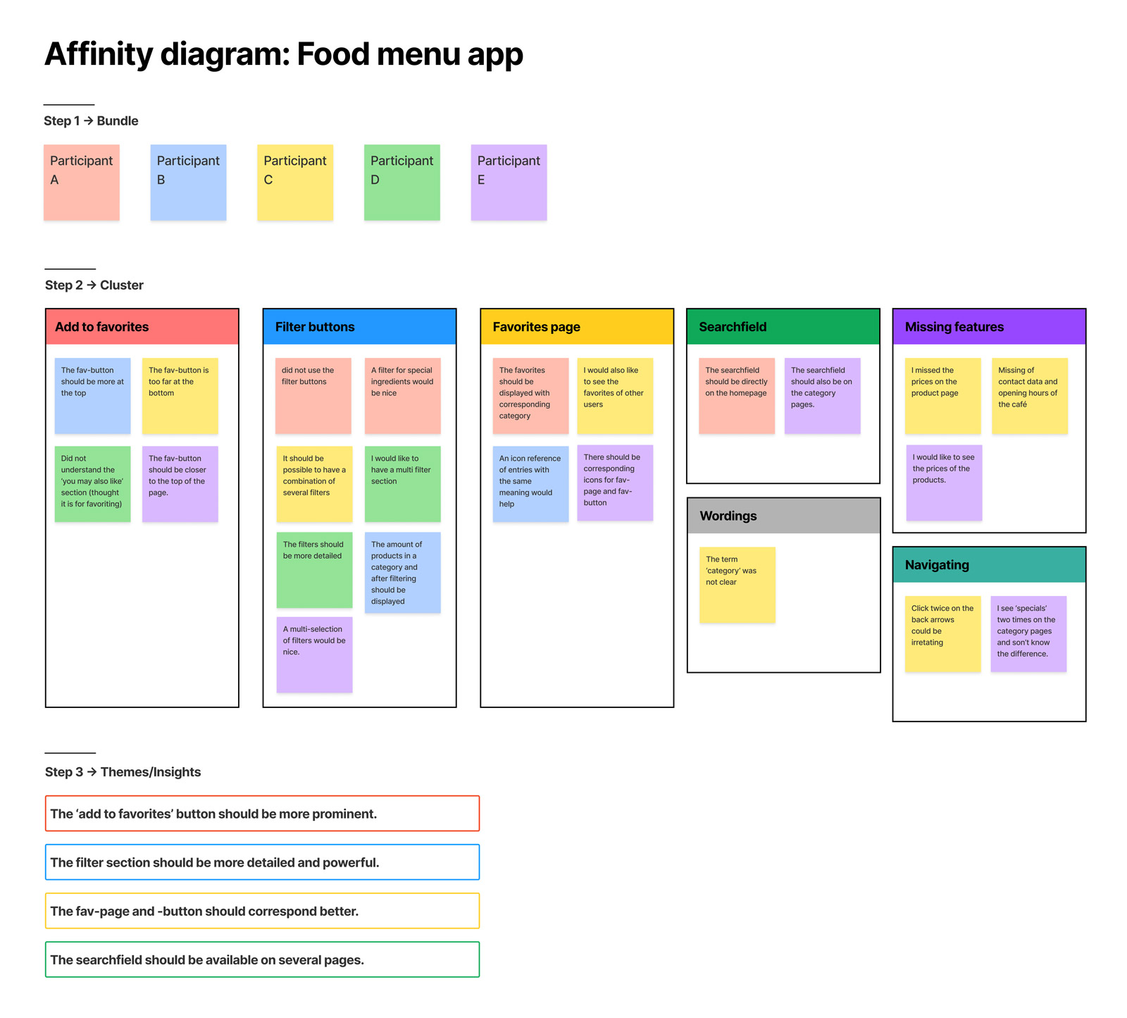
Conducting a Usability Study
I tested the Low-Fidelity Prototype with 5 potential users in a moderated usability study. These gave me a lot of good insights and new ideas. I documented these in a spread sheet and with all the information I created an affinity diagram to find similarities and build themes.
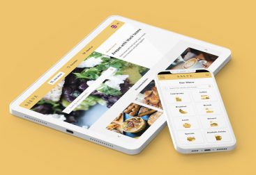
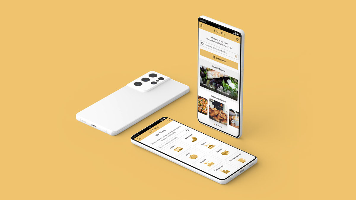
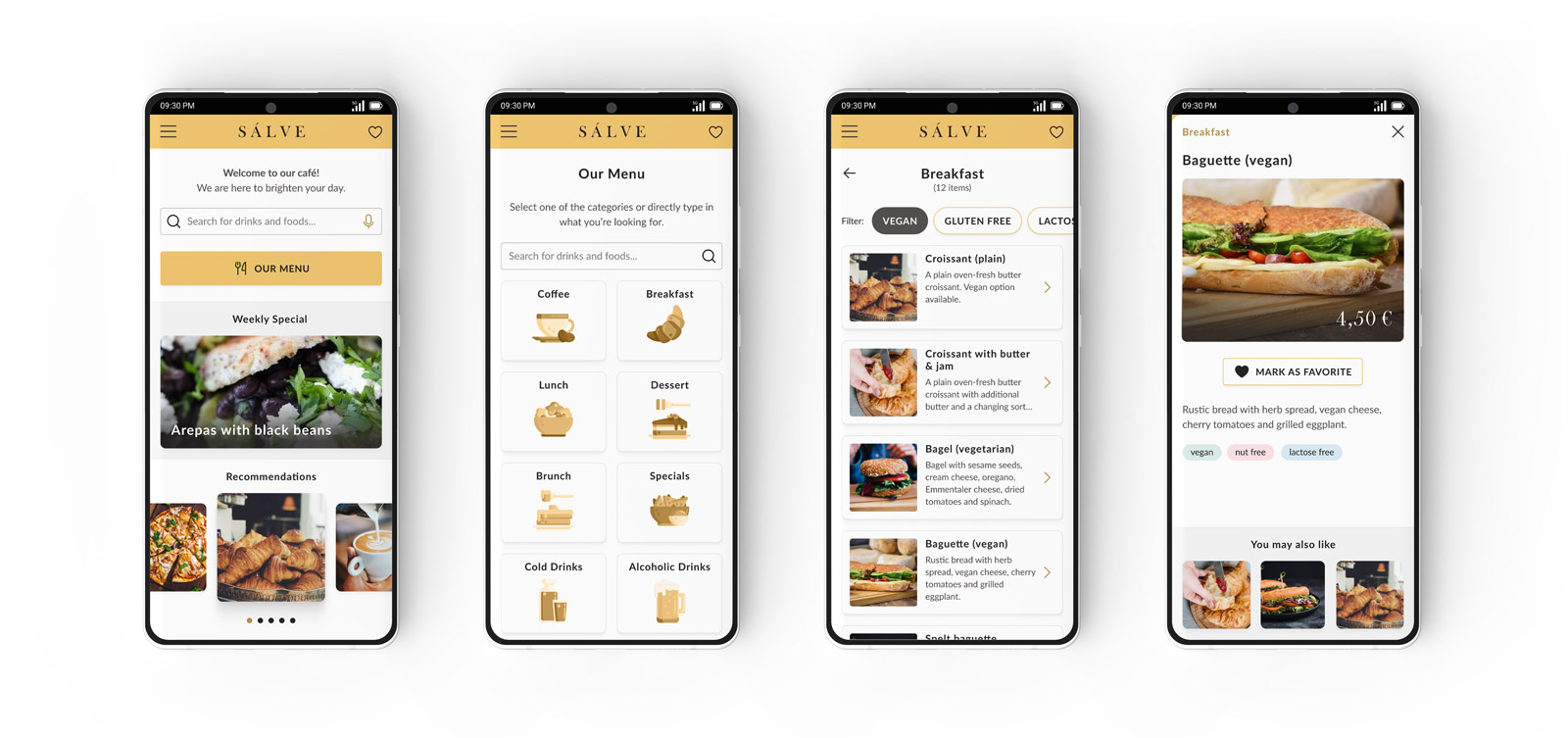
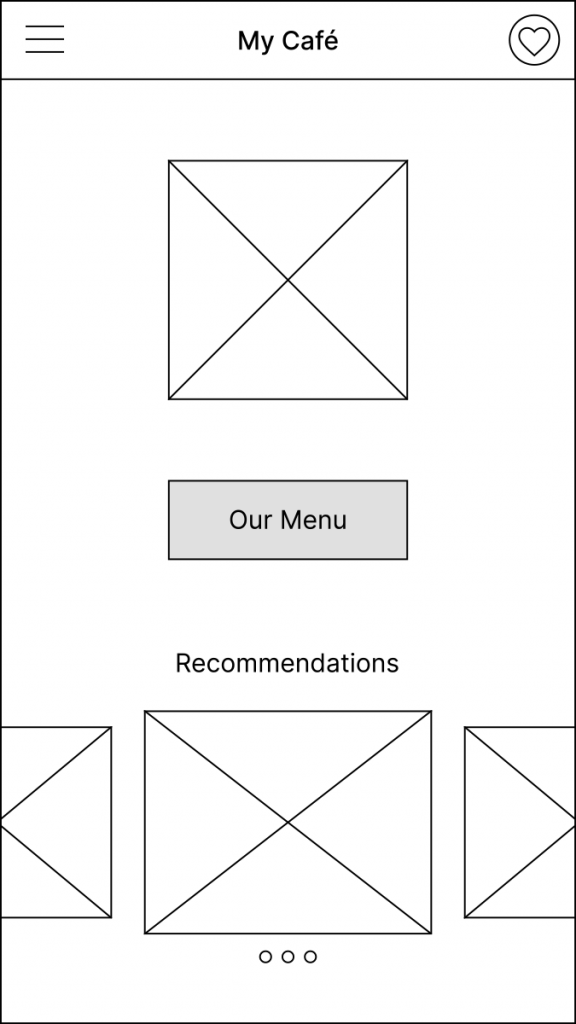
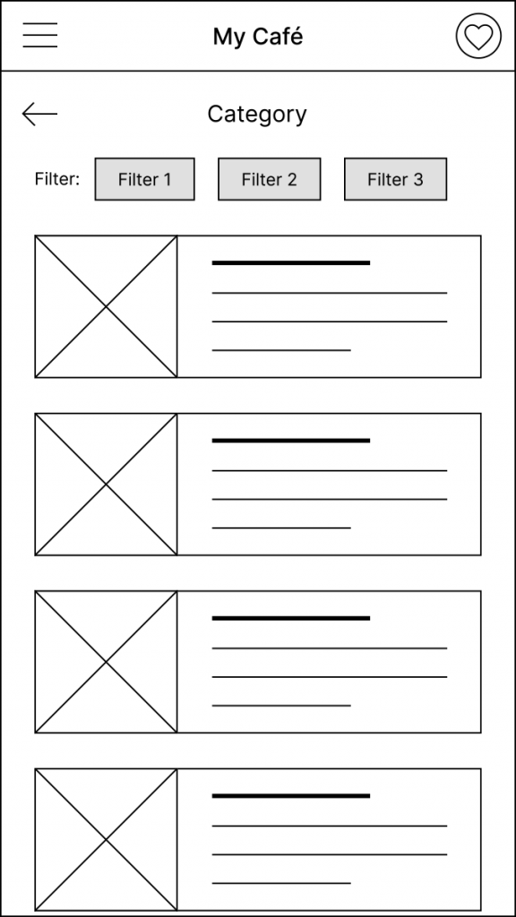
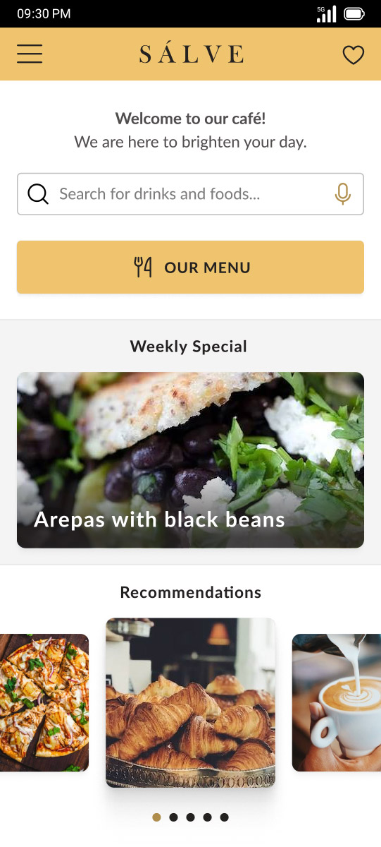
High-Fidelity Prototype
Now it was time to think about the visual appearance of the app, that means what colors and fonts to use and how to design all the different elements. As I was creating this app for a real café in my neighborhood, I already had a rough direction for that. But there was still enough space to get creative.
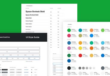
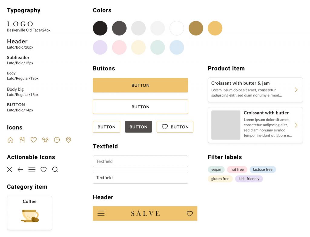
The transformation from Lo-fi to Hi-Fi was straight forward, as I mainly followed the same structure for the pages. In parallel I created a sticker sheet, that shows all the basic styles of the final app including all the font styles and colors but also the imagery and the icons as well as some returning items like buttons and form fields.
In my designs I also place a lot of value on accessibility. In that case that means high contrast colors and fonts as well as descriptive images and a clean focused look. Some selected Mockups with the final app design and the High-Fidelity Prototype can be found as followed.
What did I learn from the Food menu app?
This was the first app I completely created from scratch with going through all the phases of the design thinking framework: Emphasize, Define, Ideate, Prototype and Test.
The most learnings I had within the Emphasize and Define phases. Creating my own personas and thinking about the goals and pain points of real users was challenging but also fun. Designing with these things in mind and the user always in the center was a completely new approach.
The complete case study with much more details can be found here. Have fun with reading 🙂