The Goal
The goal was to optimize the current styles of the Searchmetrics Suite, so that it is more accessible at the end. This includes on the one hand to change the existing low contrast colors to high contrast ones, so that they pass the WCAG 2.0 guidelines for contrast accessibility. On the other hand specific colors, e.g. for charts or states needed to be changed, so that they are good readable and distinguishable for people with vision impairment. At the end all the new styles should be brought together in a complete new accessible style guide.
Outcome
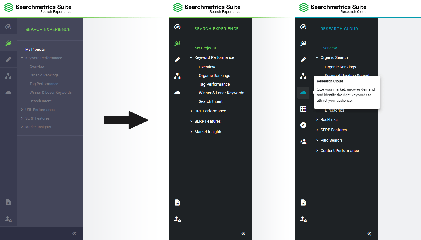
As it was not possible to change all the styles of the tool at once, I needed to focus on the most important parts first, which meant touching the things that will have the most impact for the users. I decided for the sidebar navigation first, because this is visible within all the pages of the product and should be noticed by every user.
The following screens shows on the left side the navigation before the changes were made. The links and the icons were too low in contrast. The colors were changed to what you can see on the right side. As the product colors needed to stay the same, with the very dark background these are now also much better readable. In addition the font-size was increased a little bit – another point to make the content much more readable.
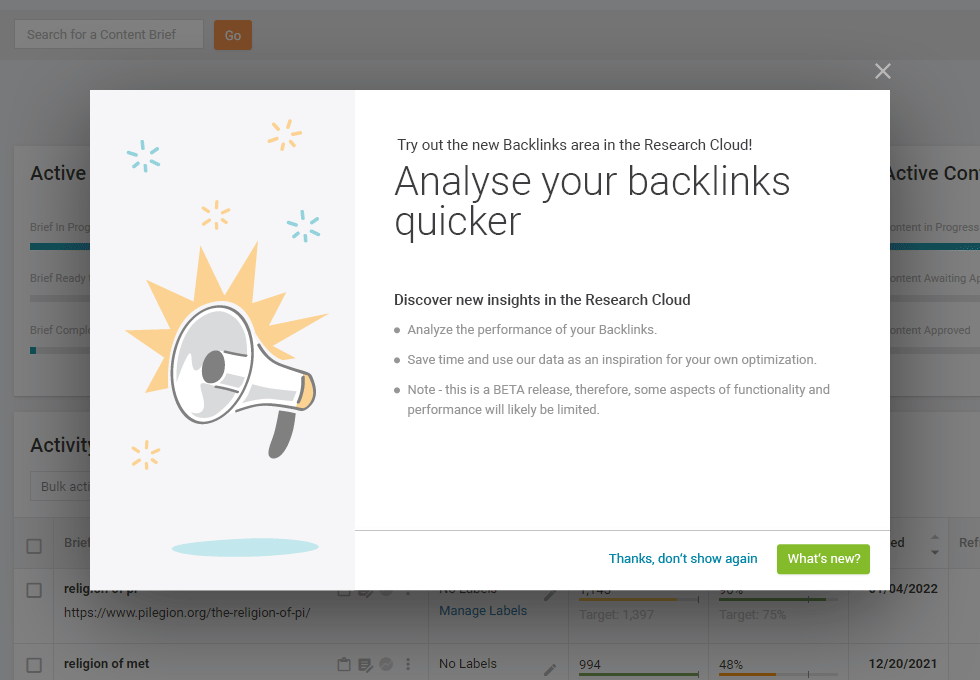
Another module that will be seen by most of the users is the announcement layer. The color for most of the content was changed to a very dark grey, so that it will now pass the contrast guidelines. The appearance of the CTAs were changed in style and color. In addition the illustration was also given more contrast but also another base color, so that it now matches the brand much better.
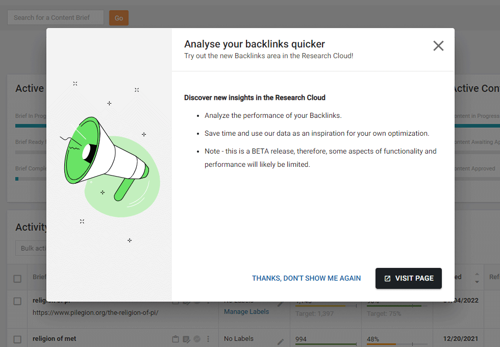
Both, the new sidebar navigation as well as the new styled announcement layer, were finally implemented and can be seen in the current Searchmetrics Suite.
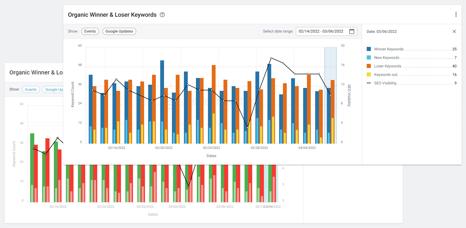
But for my studies I also wanted to have accessibility changes for the whole product. As the tool is much about data and visualizations with KPIs, tables and charts, I also needed to think about these modules. The problem with the charts for example is the usage of colors that make it hard to differentiate these for people with vision impairment. The following screen is just one example of the possible changes. But as red and green for comparison is hard to differentiate for some people, the better way is to switch to a red and blue version.
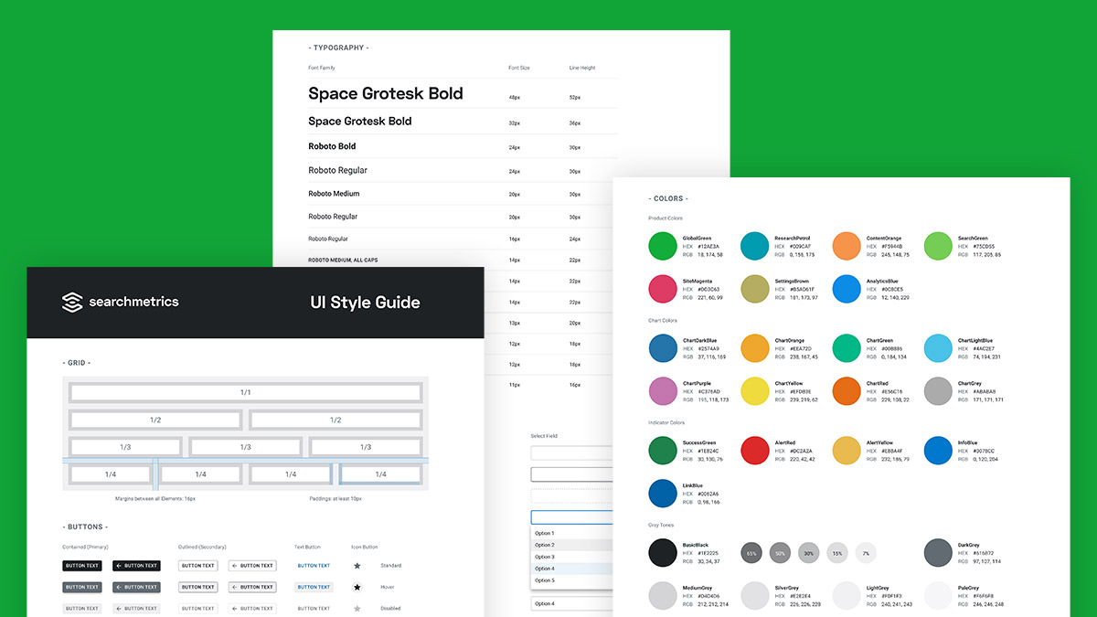
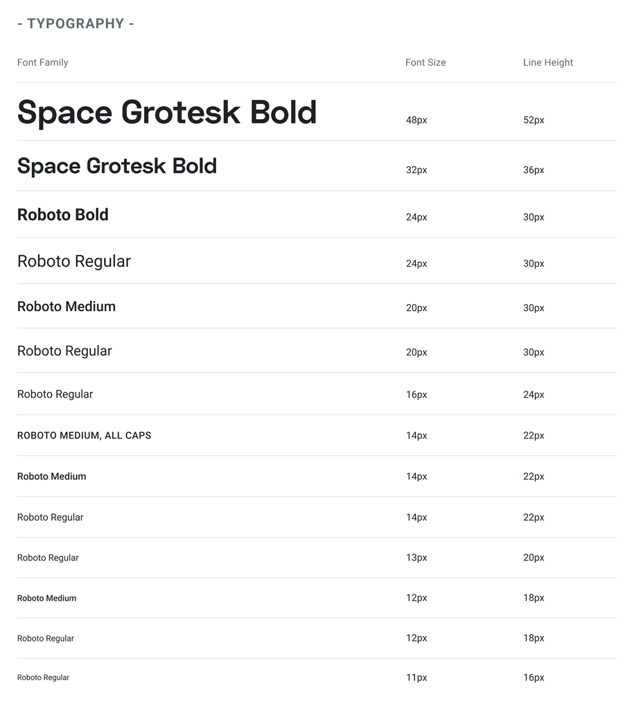
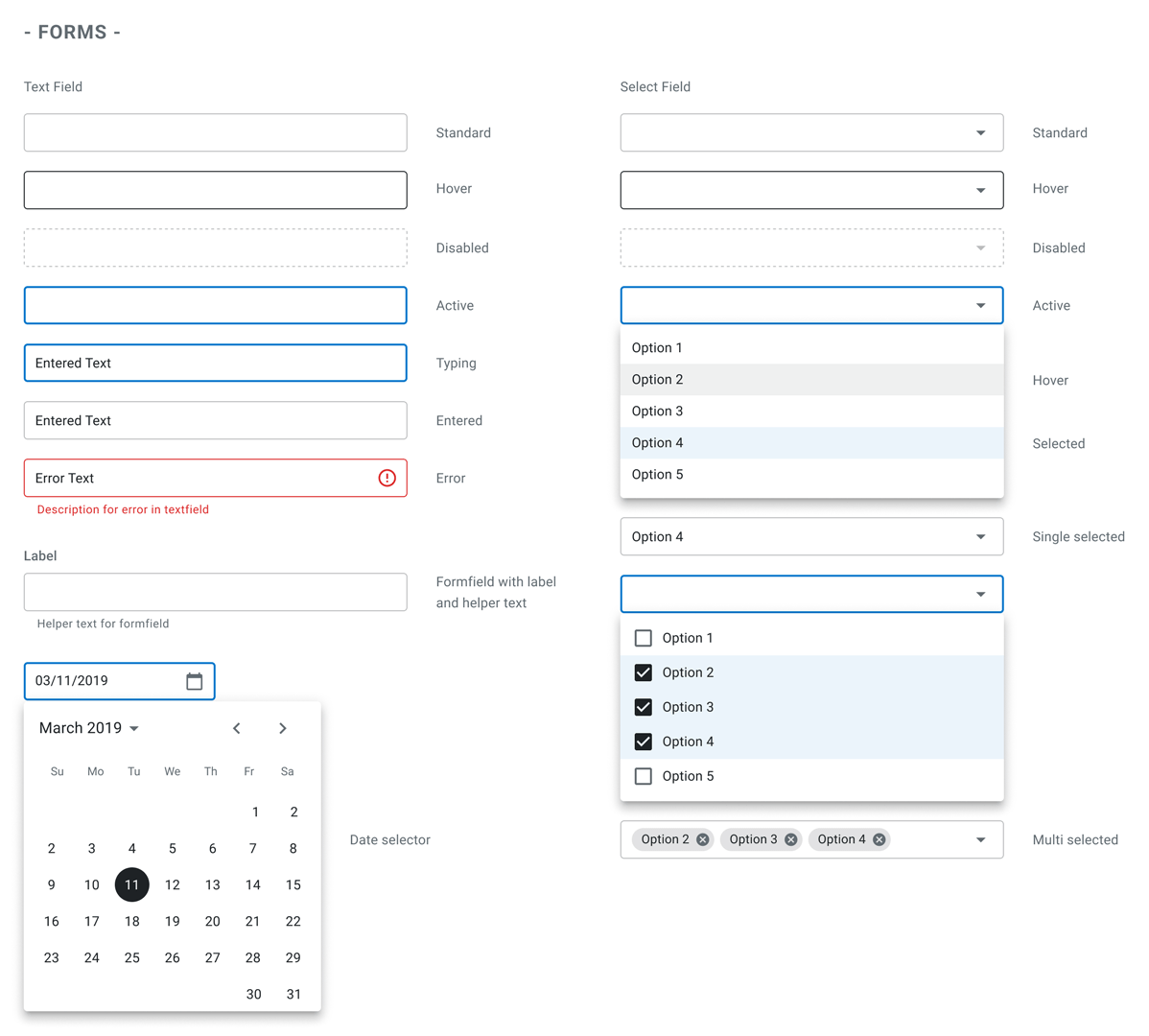
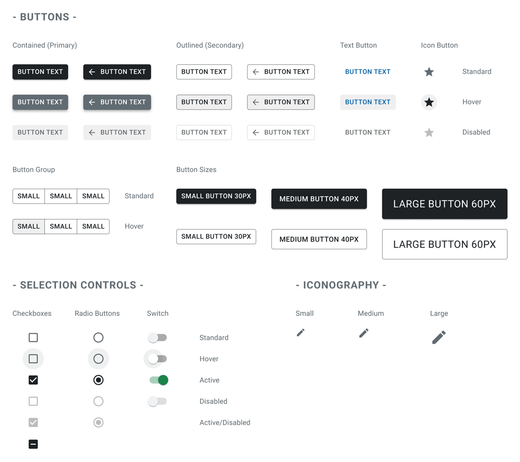
The style guide
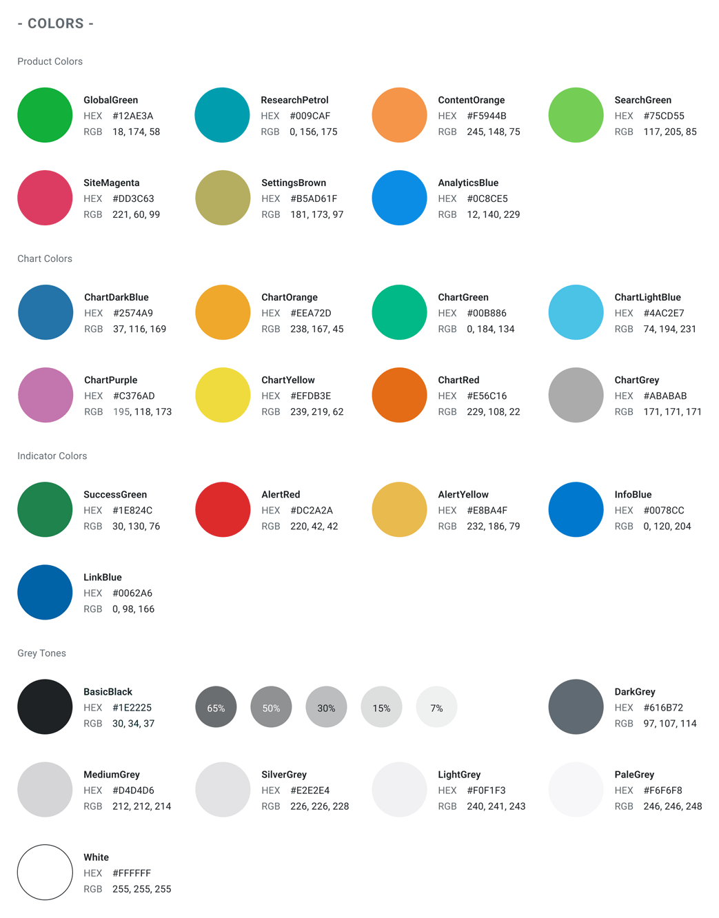
The examples above are just some of things you can do to achieve a much more accessible product. For going the next steps a guide for the development team needed to be created. With creating a new style guide that includes all my findings for fonts and colors but also the styling of basic elements like buttons, form fields, iconography and some more, will help to create a product with much better accessibility.
What did I learn from the accessible style guide?
Accessible design is an aspect everybody should think about when creating apps and online experiences. The color and contrast accessibility, that I’ve focused on here in the style guide, are just a few things to bring a much better user experience to the audience. But playing around with it and getting positive feedback showed me that it was worth the work. And in the end, everybody can benefit from it.