Showing 5 Result(s)

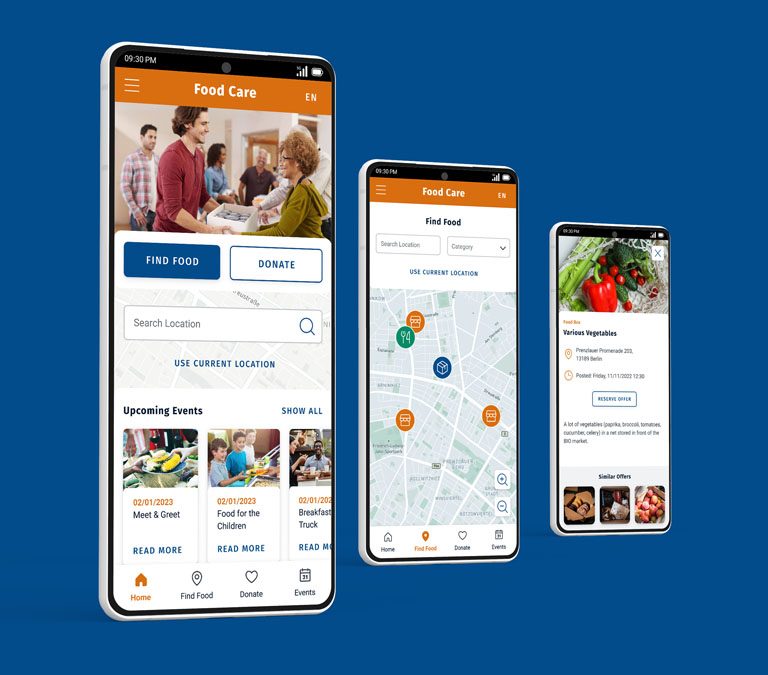
Hrmony App Optimization

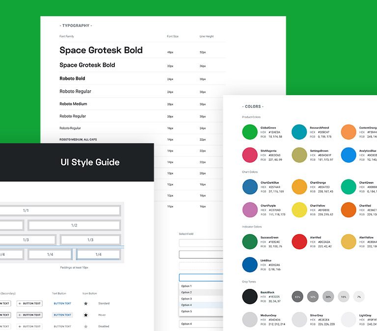
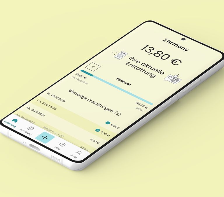
The Goal The goal was to optimize the UI and the UX of the Hrmony progressive web app, so that it is more accessible for the users and easier to understand. There were some low contrast colors on different fonts and other graphical elements that needed to be optimized, so that they pass the WCAG …

Social Good App

The Product The app is for people who want to get an overview of possibilities where to get free or cheap food in a certain location. The Problem People don’t know about all the different possibilities where to get free or cheap food on one sight. The Goal Design an app for all people with …

Food Menu App – Responsive Website

The Product This is a follow-up project for the mobile Food menu app. That means there was no need to do the Emphasize and Define phase again. The goal here was to create a responsive web design that is optimized and can be viewed on different devices like mobile phones, tablets and desktop computers. My …

Food Menu App

The Product The app is for the visitors of a café that shows the complete menu to get an overview of all the products with some additional valuable information. The Problem Customers don’t know about the offer of the café and are also not able to find all the specials (e.g. vegan options) immediately. The …

Accessible Style Guide

The Goal The goal was to optimize the current styles of the Searchmetrics Suite, so that it is more accessible at the end. This includes on the one hand to change the existing low contrast colors to high contrast ones, so that they pass the WCAG 2.0 guidelines for contrast accessibility. On the other hand …